Home | Brand Story

Real property is a rapidly-changing field, and our world and work are constantly evolving.

The Real Property Institute of Canada (RPIC) realizes this and the need for our brand to reflect the members of our growing and shifting real property community.

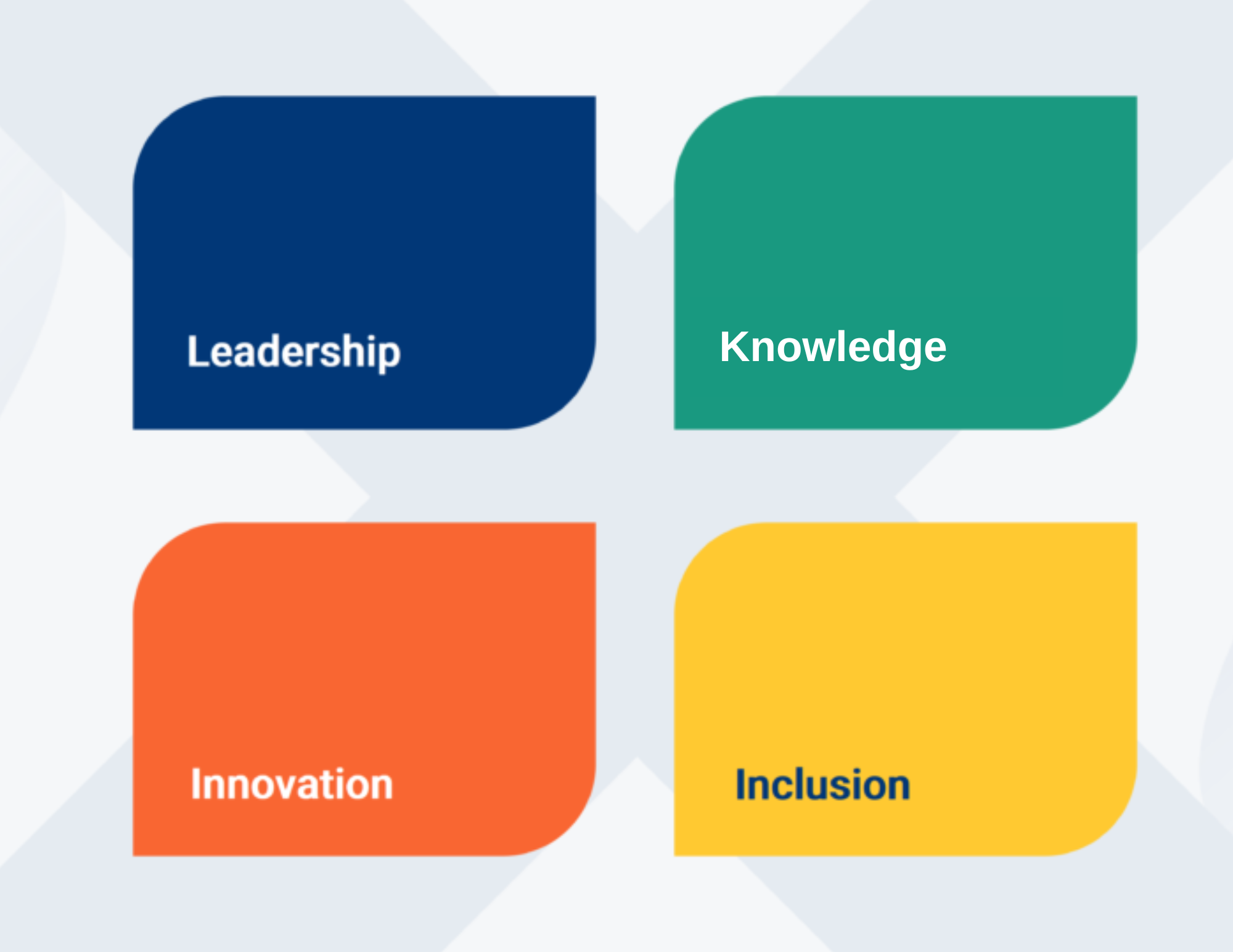
At RPIC, we strive to create a space where community, collaboration, and inclusivity are at the forefront of everything we do. We are proud to represent the great qualities of this community with a new logo that reflects your commitment to knowledge, leadership, and innovation.

Image with 4 squares, leadership, knowledge, innovation, inclusion

The colours of our logo represent the qualities championed by those in our community: leadership, knowledge, innovation, and inclusion.

These colours also represent the federal priorities that you care about most. Green is aligned with Canada’s commitment to greening & sustainability, while orange is symbolic of reconciliation with Indigenous groups.


The longer you look at it, the more you see.

Our logo is rich with symbolism that speaks to who we strive to be. We hope that each individual will have a different experience when they look at our logo and that you’ll find the story you resonate with most.

RPIC logo

At first glance, you might see what looks like people with their arms outstretched. This represents our welcoming and inclusive community. You might also notice that the people can look like chevrons pointing towards a centre space. This represents the space where the real property community comes together.

To others, our logo might look like a spark. This reflects our mission to spark excitement, curiosity, and connections within the real property field. Some have also said that they see a snowflake in our logo, which speaks to the fact that RPIC’s diverse community comes together to create a one-of-a-kind and completely unique space.


What do you see? We’re proud to have a logo that celebrates our commitment to being a hub for collaboration, learning, and growth for YOU.